

Navigating the Alerts Section
1
Navigate to Alerts
Click Alerts in the main navigation.
2
Review Alerts at a glance
The Alerts page is broken into sections for each key payment metric. Each section contains a visual representation of the last 90 days, with each day (see timezone information below) demonstrated by a grey, green, or red bar:
Grey - Not Available
Grey - Not Available
Grey bars indicate days for which data is not available:
- If a historical date is grey, we didn’t evaluate your data that day for anomalies
- If the most recent date is grey, we may still be processing your incoming data.
- For chargeback metrics, grey can also indicate your chargebacks volume on that date was too low to meet the required threshold.
Green - No New Issues
Green - No New Issues
Green bars indicate no new anomalies were detected that day. Your data was consistent with historical measurements and didn’t cross your custom static thresholds.
Red - Alert
Red - Alert
Red bars indicate an alert—we have registered an anomaly in your payments data. Where you see red, you may have a problem worth digging into.
3
Dig into the data
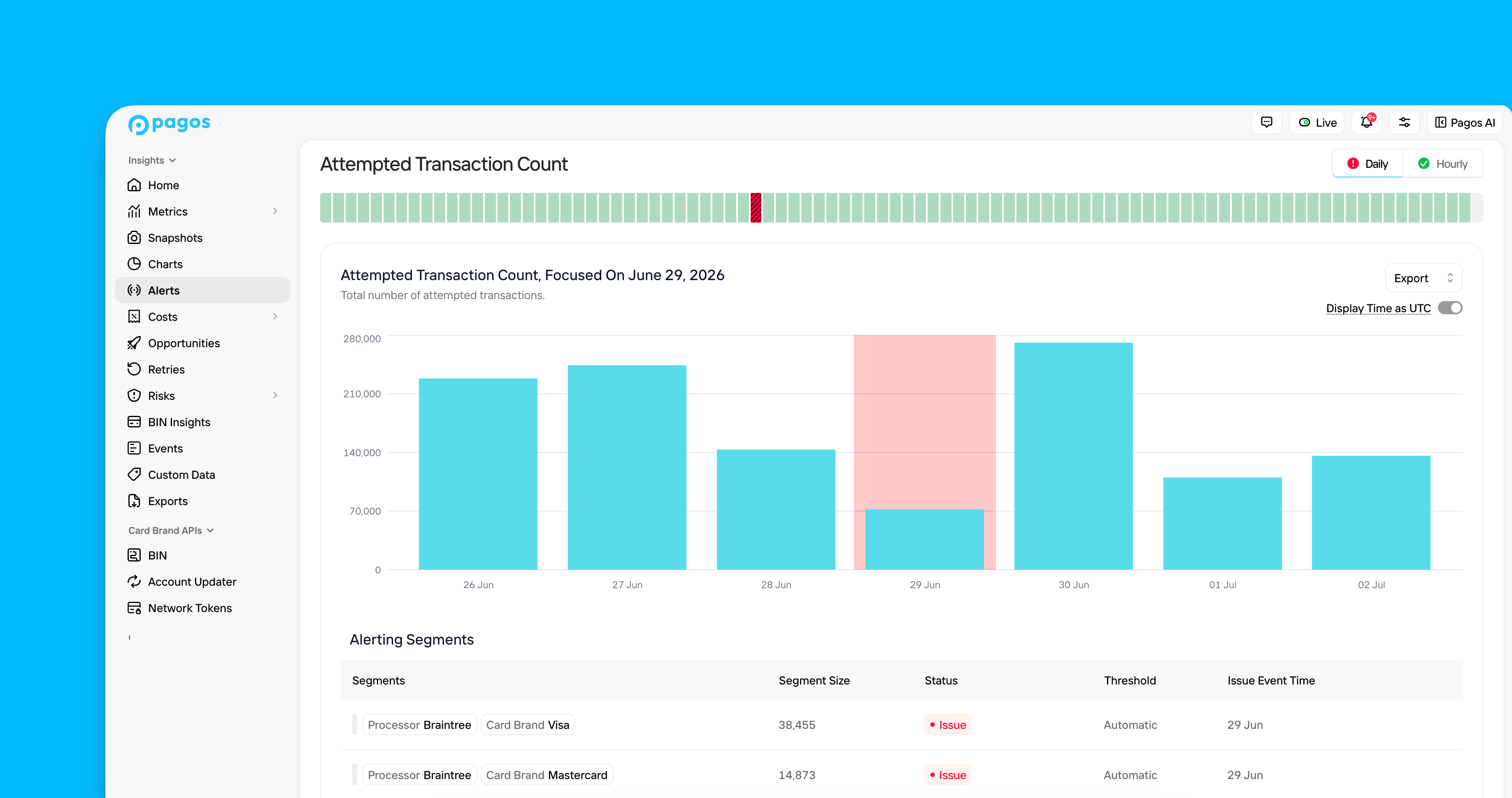
Under a chosen metric, click the bar for a given day. This opens an Alerts Metric Details page containing the following data visualizations focused on that date:
4
Build out Custom Segments (Optional)
If you have specific market segments you need to monitor or static threshold values you target (e.g. 90% approval rate), navigate to any Alert Metric Details page and click Custom Segment to customize your data monitoring.
Alert Notifications
When an anomaly occurs in your data and generates an alert, you can receive a notification in the Pagos Service Panel, via email, or even in a Slack channel. Learn how to configure these notifications in the Managing Your Pagos Account guide.Alert Timing
A “day” in the Alerts section is measured as 12:00AM - 11:59PM UTC. If your account is set to a different time zone, the exact measurements shown for a specific day in Alerts may not match what you see for that same day in other charts within the Pagos Service Panel. Your data connection type determines when Pagos receives and reviews segments of your data for anomalies:- Direct, no-code data connections (e.g. Braintree, Stripe, Adyen) and the Data Ingestion API - We begin reviewing your data from the previous day at approximately 2AM UTC; as we receive and process more data segments, your dashboard updates continuously.
- File-based connections (e.g. JP Morgan Chase, WorldPay Vantiv) - Alerts appear in the dashboard after Pagos receives and processes your files. To ensure data completeness, this can take up to three days. While we review the data, the bar for that day will appear grey.
Hourly Alerts
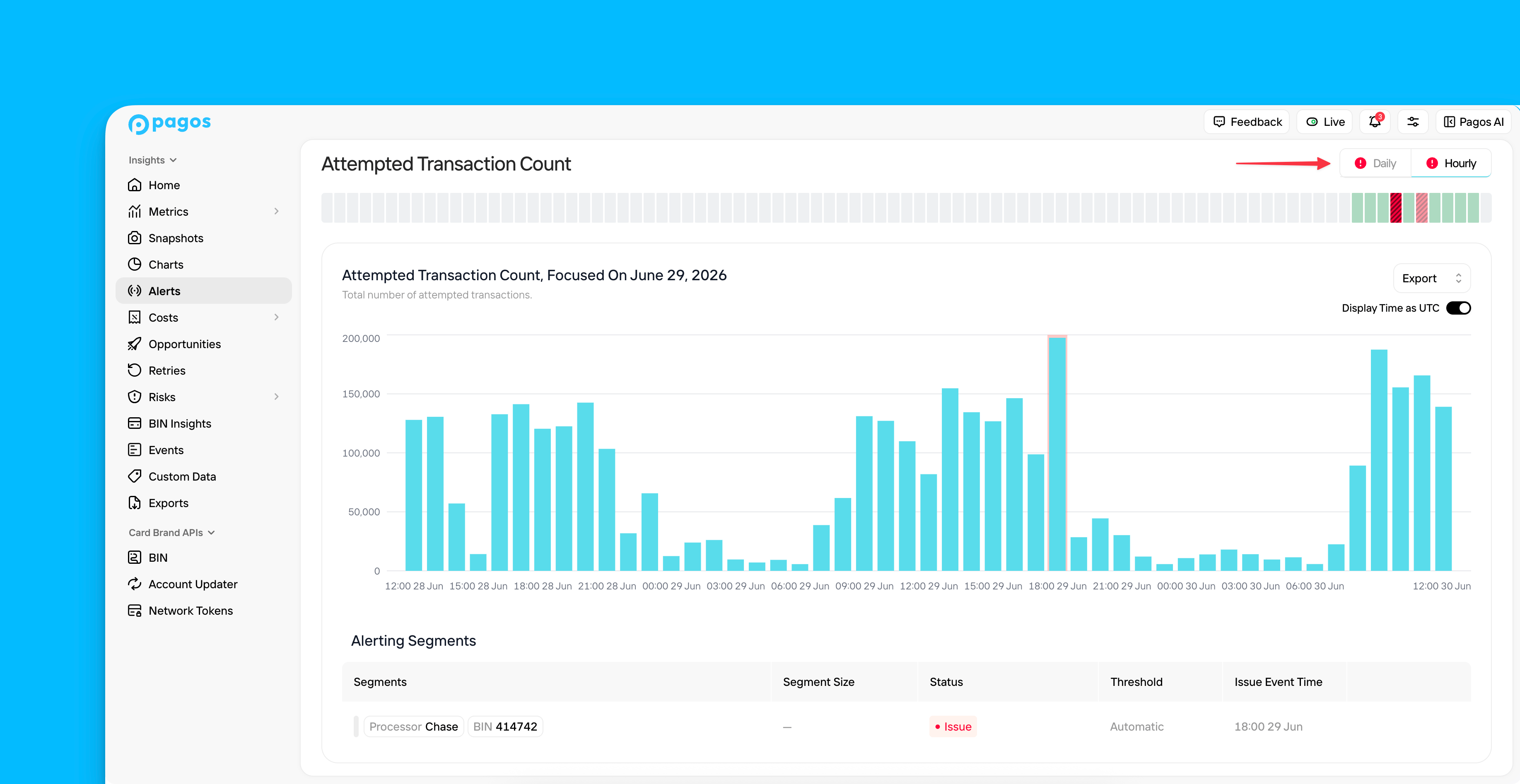
For Approval Rate and Attempted Transaction Count, we monitor both daily and hourly data ingested from your processors. Click the Daily/Hourly switcher in the top-right corner of the details page to view hourly data for the selected day. If you have anomalies in your hourly data, the Hourly icon will be red, and the data visualizations on the hourly details page will highlight the specific hours where you experienced an anomaly.View Hourly Alerts Toggle
View Hourly Alerts Toggle
Alert Metrics
Identify at a glance when your business experienced unexpected and abnormal changes to the following key payment metrics:Transaction Metrics
Approval Rate
Approval Rate
The percentage of transactions processed that were ultimately approved, calculated by dividing by the total number of approved transactions by the total number of attempted transactions
Attempted Transaction Count
Attempted Transaction Count
The total number of attempted transactions
Decline Rate
Decline Rate
The percentage of total attempted transactions declined with a specific decline code; calculated by dividing the total number of declines with that decline code by the total number of attempted transactions
Refund Metrics
Refund Count
Refund Count
The total number of refunded transactions
Chargeback Metrics
Chargeback Count
Chargeback Count
The total number of disputed card-based transactions
Focus Graph
The first visual on the Alert Metric Details page is a focus graph. This graph demonstrates the chosen metric over the course of a week for your entire transaction volume, with the focus date in the middle of the week. This provides context on how that focus day measures up against the surrounding days. For count or value metrics (e.g. attempted transaction count), this will be a bar graph; rate metrics (e.g. approval rate) will appear as line graphs. If you click the Focus icon for any particular segment in the Alerting Segments or Monitored Segments sections, this graph will filter to only show the data for the chosen segment over that same week. Click Focus again to remove the filters from the graph.Export Options
Alerts is a starting point for identifying areas of concern in your payments data. To continue your analysis, you can seamlessly navigate to another area of the Pagos Service Panel and view the same data from a different angle. To do so, click Export in the top-right corner of your focus graph, then select from the following options under Open with:Metrics
Metrics
Charts
Charts
Open Charts with a custom visualization of the exact same data in your Alerts focus graph. Charts has more features for data manipulation, including additional filter options and chart styles. Save your chart for future use, so you can continue to monitor this concerning data segment.
Events
Events
Open the Events page to view the exact transaction events behind the data in your focus chart.
If you focus the Alerts graph on any particular data segment, those filters will carry over to any of the Open with… options.