> ## Documentation Index
> Fetch the complete documentation index at: https://docs.pagos.ai/llms.txt
> Use this file to discover all available pages before exploring further.
# Costs
> The Costs section of Insights demonstrates your payments costs over time, helping you identify the sources of the biggest drains on your revenue.
 Payment processing inherently comes with costs of all kinds—bank fees like interchange rates, assessment fees from card brands, and processor fees from the payment processors themselves. Understanding what costs you're accumulating and from where can help your business assess overall profitability and performance. When you know where costs come from, you might even find opportunities to reduce them and improve your bottom line!
Costs contains the following pages:
* [Fees](#fees)
* [Invoices](#invoices)
* [Effective Rate](#effective-rate)
* [Interchange & Assessments](#interchange-%26-assessments)
* [Penalties](#penalties)
**Important Notes About the Costs Pages**:
* The Date Range filter defaults to a **Monthly** time interval, because processors provide cost data on a monthly cadence.
* Any time-sensitive data appears in Coordinated Universal Time (UTC).
## Navigating the Costs Pages
Below is a basic outline of how to navigate around your Costs pages. For more details on a specific Costs page, see the affiliated section.
To navigate the Costs pages:
Click **Costs** in the main navigation, then click the desired Costs page. For [Fees](#fees) and [Invoices](#invoices), choose the appropriate page to view your data broken down **by Category** or **by Subcategory**.
* Fee categories include Interchange, Assessments, Processor, and more. View our [Fee Type Category Codes](/response-codes/fees/fee-type-category-codes) reference guide for a complete list.
* Fee subcategories further break fees down by details such as value added services, adjustments, processor penalties, and more. View all subcategories in our [Fee Type Subcategory Codes](/response-codes/fees/fee-type-subcategory-codes) reference guide.
Click a tab at the top of the page to determine how we break down your cost data in the bar graph (i.e. the x-axis values), for example by **Processor** or **Card Brand**. The tab options are different on each Costs page.
Each tab displays your entire dataset for the selected time period. For example, the **Card Brand** tab on the **Fees by Category** page focuses on the per-card brand breakdown of your fees, but it still displays all your fee data—not just fees associated with card transactions. Non-card transactions appear under their own payment methods alongside the card brand buckets. To only view cost data for specific segments of your data (e.g. only card transactions), use the [filter options](#cost-filters).
Use the **Date Range** filter in the top-right corner of the page to change the time period. You can view data broken down by Month, Quarter, or Year.
Click **Add Filter** to filter for specific segments of cost data. Learn more about the filter options available in Costs pages [in the section below](#cost-filters).
Each page contains a graph and a table, demonstrating your cost data for the chosen time period. How your cost data is broken down in these visualizations depends on the page and tab you select.
* Click the **Compare to Previous Period** toggle to add the cost data from the previous period to the graph.
* Manipulate the data using the [Dimensions drop-down](#dimensions-drop-down-menu).
Click **Export** to select from the following options:
* **Aggregated Data** - Download the data displayed in the table, plus fee description information, aggregated by month. If you've applied any [filters](#cost-filters) to your data, these customizations will be reflected in the exported data. Downloaded files will appear in your **Exports** page.
* **Enhanced Data** - Download the same data as the **Aggregated** option, but without the monthly aggregation.
* **Transaction-Level Data** - At an additional cost, download data for the individual transactions included in the table. Downloaded files will appear in your **Exports** page; learn more in our [Pagos Transaction Level Data Exports](/insights/data-exports) guide.
## Fees
There are two separate pages for viewing your fee data:
* **Fees by Category**
* **Fees by Subcategory**
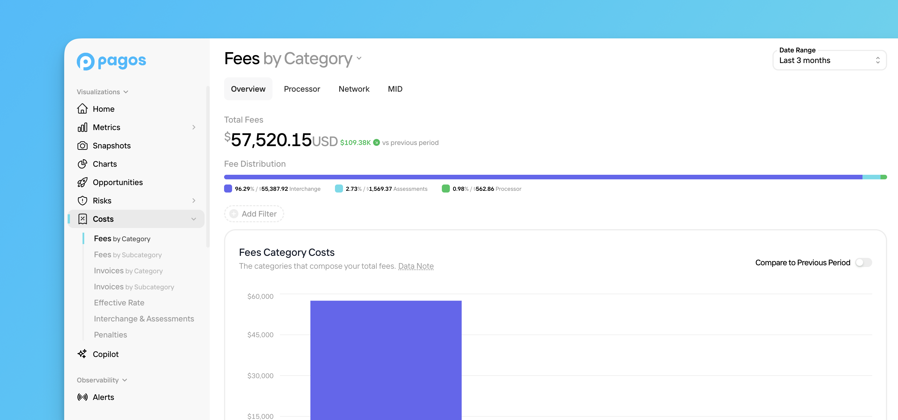
In either page, the **Total Fees** value at the top of the page shows the total amount of fees your business faced in the chosen time period, along with a comparison to the previous time period. Select from the following tabs to determine how we'll organize your fee data:
In the **Overview** tab, you'll find the following data visualizations:
* **Fee Distribution** - A bar demonstrating the distribution of your total fees by category/subcategory.
* **Fees Category/Subcategory Costs** - A stacked bar graph demonstating your total fee amount over time, broken down by category/subcategory.
* **Fees Category/Subcategory Breakdown** - A table with rows for each category/subcategory and columns for each time interval; use the [Dimensions drop-down](#dimensions-drop-down-menu) to customize the table.
In the **Processor** tab, you'll find the following data visualizations:
* **Fee Distribution** - A bar demonstrating the distribution of your total fees by processor.
* **Fees Category/Subcategory Costs** - A stacked bar graph demonstating your total fee amount for each of your individual processors, broken down by category/subcategory.
* **Fees Category/Subcategory Breakdown** - A table with rows for each category/subcategory and columns for each of your processors; use the [Dimensions drop-down](#dimensions-drop-down-menu) to customize the table.
In the **Network** tab, you'll find the following data visualizations:
* **Fee Distribution** - A bar demonstrating the distribution of your total fees by card network.
* **Fees Category/Subcategory Costs** - A stacked bar graph demonstating your total fee amount for each card network, broken down by category/subcategory.
* **Fees Category/Subcategory Breakdown** - A table with rows for each category/subcategory and columns for each card network; use the [Dimensions drop-down](#dimensions-drop-down-menu) to customize the table.
In the **MID** tab, you'll find the following data visualizations:
* **Fee Distribution** - A bar demonstrating the distribution of your total fees by MID. Keep in mind, only those MIDs with the most fees will appear; those with minimal fees will be group together under the category of *All Other MIDs*.
* **Fees Category/Subcategory Costs** - A stacked bar graph demonstating your total fee amount for each MID, broken down by category/subcategory.
* **Fees Category/Subcategory Breakdown** - A table with rows for each category/subcategory and columns for each MID; scroll horizontally to view all MIDs and use the [Dimensions drop-down](#dimensions-drop-down-menu) to customize the table.
Use the [**Only New Fees** toggle](#new-fee-filtering) to filter the data visualizations for fees you haven't seen before.
## Invoices
The Invoices pages only shows data imported from Adyen and Braintree.
There are two separate pages for viewing your invoice data:
* **Invoices by Category**
* **Invoices by Subcategory**
In either page, the **Total Invoices** value at the top of the page shows the total amount of invoiced fees from Adyen and/or Braintree in the chosen time period, along with a comparison to the previous time period. Select from the following tabs to determine how we’ll organize your invoiced fee data:
In the **Overview** tab, you'll find the following data visualizations:
* **Invoice Distribution** - A bar demonstrating the distribution of your total invoices by category/subcategory.
* **Invoices Category/Subcategory Costs** - A stacked bar graph demonstating your total invoice amount over time, broken down by category/subcategory.
* **Invoices Category/Subcategory Breakdown** - A table with rows for each invoice category/subcategory and columns for each time interval; use the [Dimensions drop-down](#dimensions-drop-down-menu) to customize the table.
In the **Processor** tab, you'll find the following data visualizations:
* **Invoice Distribution** - A bar demonstrating the distribution of your total invoices by processor.
* **Invoices Category/Subcategory Costs** - A stacked bar graph demonstating your total invoice amount for each of your individual processors, broken down by category/subcategory.
* **Invoices Category/Subcategory Breakdown** - A table with rows for each invoice category/subcategory and columns for each of your processors; use the [Dimensions drop-down](#dimensions-drop-down-menu) to customize the table.
In the **MID** tab, you'll find the following data visualizations:
* **Invoice Distribution** - A bar demonstrating the distribution of your total invoices by MID. Keep in mind, only those MIDs with the most invoices will appear; those with minimal invoices will be group together under the category of *All Other MIDs*.
* **Invoices Category/Subcategory Costs** - A stacked bar graph demonstating your total invoice amount for each MID, broken down by category/subcategory.
* **Invoices Category/Subcategory Breakdown** - A table with rows for each invoice category/subcategory and columns for each MID; scroll horizontally to view all MIDs and use the [Dimensions drop-down](#dimensions-drop-down-menu) to customize the table.
## Effective Rate
**Data Availability:**
* The Effective Rate page only shows data imported via the [Data Ingestion API](/importing-data/the-pagos-data-ingestion-services#api-method) or from the following processors: Adyen, Amex, Braintree, Chase, dLocal, Ebanx, Klarna, PayPal, Stripe, and Worldpay (Vantiv)
* At this time, you can't use the **Payment Method Type** or **Card Brand Data** filters to filter Braintree data on the Effective Rate page.
Effective rate is calculated by dividing your total fee amount by your gross sales value. The gross sales value is the total value of all approved transactions processed in the chosen time period, calculated before subtracting any refunds or chargebacks; the total fee amount includes all interchange, assessment, and processor fees.
The **Effective Rate** page contains a line graph and table demonstrating your effective rate over the last 3 months; click a row in the table to view the fee and sale amounts used to calculate the stated effective rate.
Select from the following tabs at the top of the page to view your effective rate for segments of your transaction volume. The tab you choose determines what customer segments the graph and table show effective rate data for:
The line graph demonstrates the effective rate over time for your entire transaction volume.
The graph includes lines charting the effective rate over time for each processor you've routed transactions through. Use the table to remove or add specific processors to the graph.
The graph includes lines charting the effective rate over time for each card brand you've processed transactions for. Use the table to remove or add specific card networks to the graph.
The graph includes lines charting the effective rate over time for each MID you've processed transactions through. Use the table to remove or add specific MIDs to the graph.
If you process transactions through Chase, keep in mind that Chase doesn't always pass MID information in the reports used to generate effective rate. When the MID is missing, this graph will display effective rate for the entire Chase [data connection](/importing-data/managing-data-connections).
The graph includes lines charting the effective rate over time for each type of payment method you've processed transactions for (e.g. card, Applepay, Klarna, etc). Use the table to remove or add specific payment methods to the graph.
The graph includes lines charting the effective rate over time for each settlement currency you've processed transactions in (e.g. USD, AUD, CAD, etc). Use the table to remove or add specific currencies to the graph.
## Interchange & Assessments
The Interchange & Assessments page only shows data imported from Adyen.
The **Total Fees** value at the top of this page shows the total amount of fees your business faced in the Interchange and Assessments cost categories for transactions processed through Adyen in the chosen time period, along with a comparison to the previous time period. Select from the following tabs to determine how we organize your fee data:
In the **Overview** tab, you'll find the following data visualizations:
* **Fee Distribution** - A bar demonstrating the distribution of your total Interchange and Assessments fees by subcategory.
* **Interchange & Assessments Costs** - A stacked bar graph demonstating your total Interchange and Assessments fee amount over time, broken down by subcategory.
* **Interchange & Assessments Breakdown** - A table with rows for each Interchange and Assessments fee subcategory and columns for each time interval; use the [Dimensions drop-down](#dimensions-drop-down-menu) to customize the table.
In the **Network** tab, you'll find the following data visualizations:
* **Fee Distribution** - A bar demonstrating the distribution of your total Interchange and Assessment fees by network.
* **Interchange & Assessments Costs** - A stacked bar graph demonstating your total Interchange and Assessments fee amount for each card network, broken down by subcategory.
* **Interchange & Assessments Breakdown** - A table with rows for each Interchange and Assessments fee subcategory and columns for each card network; use the [Dimensions drop-down](#dimensions-drop-down-menu) to customize the table.
In the **MID** tab, you'll find the following data visualizations:
* **Fee Distribution** - A bar demonstrating the distribution of your total Interchange and Assessments fees by MID. Keep in mind, only those MIDs with the most fees will appear; those with minimal fees will be group together under the category of *All Other MIDs*.
* **Interchange & Assessments Costs** - A stacked bar graph demonstating your total Interchange and Assessments fee amount for each MID, broken down by subcategory.
* **Interchange & Assessments Breakdown** - A table with rows for each Interchange and Assessments fee subcategory and columns for each MID; scroll horizontally to view all MIDs and use the [Dimensions drop-down](#dimensions-drop-down-menu) to customize the table.
Use the [**Only New Fees** toggle](#new-fee-filtering) to filter the data visualizations for fees you haven't seen before.
## Penalties
The Penalties page only shows data imported from Adyen, Braintree, Chase, Stripe, Worldpay (Vantiv), and Worldpay Core.
Managing the many charges and penalties your business faces when processing payments can easily become overwhelming. As such, this page is dedicated specifically to helping you understand and ultimately reduce the penalties you pay. The total amount of penalties paid in the given time period appears at the top of the page, along with a comparison to the previous time period. Select from the following tabs to determine how we organize your penalty data:
In the **Overview** tab, you'll find the following data visualizations:
* **Penalties** - A stacked bar graph demonstrating your total penalties over time, broken down by penalty type.
* **Penalty Breakdown & Guidance** - A table with rows for each penalty type and columns for each time interval. Click on a penalty to view a full description of the penalty, along with practical guidance on how to avoid it moving forward. Click **Export** in the top-right corner of the table to export the data, descriptions, and guidance as a CSV.
In the **Processor** tab, you'll find the following data visualizations:
* **Penalties** - A stacked bar graph demonstrating your total penalties for each processor, broken down by penalty type.
* **Penalty Breakdown & Guidance** - A table with rows for each penalty type and columns for each processor you use. Click on a penalty to view a full description of the penalty, along with practical guidance on how to avoid it moving forward. Click **Export** in the top-right corner of the table to export the data, descriptions, and guidance as a CSV.
In the **Network** tab, you'll find the following data visualizations:
* **Penalties** - A stacked bar graph demonstrating your total penalties for each card network, broken down by penalty type.
* **Penalty Breakdown & Guidance** - A table with rows for each penalty type and columns for each card network you accept. Click on a penalty to view a full description of the penalty, along with practical guidance on how to avoid it moving forward. Click **Export** in the top-right corner of the table to export the data, descriptions, and guidance as a CSV.
In the **MID** tab, you'll find the following data visualizations:
* **Penalties** - A stacked bar graph demonstrating your total penalties for each of your MIDs, broken down by penalty type.
* **Penalty Breakdown & Guidance** - A table with rows for each penalty type and columns for each MID; scroll horizontally to view all MIDs. Click on a penalty to view a full description of the penalty, along with practical guidance on how to avoid it moving forward. Click **Export** in the top-right corner of the table to export the data, descriptions, and guidance as a CSV.
## Cost Filters
The Costs section only shows data related to payment processing costs. As such, not all of the [filter options](/insights/insights-data-filters#filter-options) available elsewhere in Insights apply to this section. You can use the following filters to segment the data displayed in the Costs pages:
* Date Range
* Processor
* Card Brand
* Card Type (this filter only applies to the **Interchange & Assessments** page)
* Payment Method Type
* Settlement Currency
* [Fee Type](/response-codes/fees/fee-type-codes)
* [Fee Category](/response-codes/fees/fee-type-category-codes)
### New Fee Filtering
The [Fees](#fees) and [Interchange & Assessments](#interchange-and-assessments) pages include a **Only New Fees** toggle in the top-right corner of the stacked bar graph. Click this toggle to filter the entire page to only show data for the newest fees you've faced.
We define new fees as those you haven't encountered before on a given MID and from a given card network. Because we evaluate fees at the MID and card network level, a fee will still be flagged as new even if it has shown up before on a different MID or from a different network on the same MID.
If you apply this filter and export the data, the downloaded CSV will include a **New Fee** column. Each fee will be marked as either:
* *yes* - A confirmed new fee for the associated MID and/or card network
* *under review* - A fee we're reviewing and mapping
Fees marked *under review* may appear with the name *Unknown* until we finalize their details; check back later for updates.
The **Only New Fees** toggle doesn't account for:
* Fee adjustments
* Fees in the [fee category](/response-codes/fees/fee-type-category-codes) of `informational_data`
* Changes in fee amounts or rates
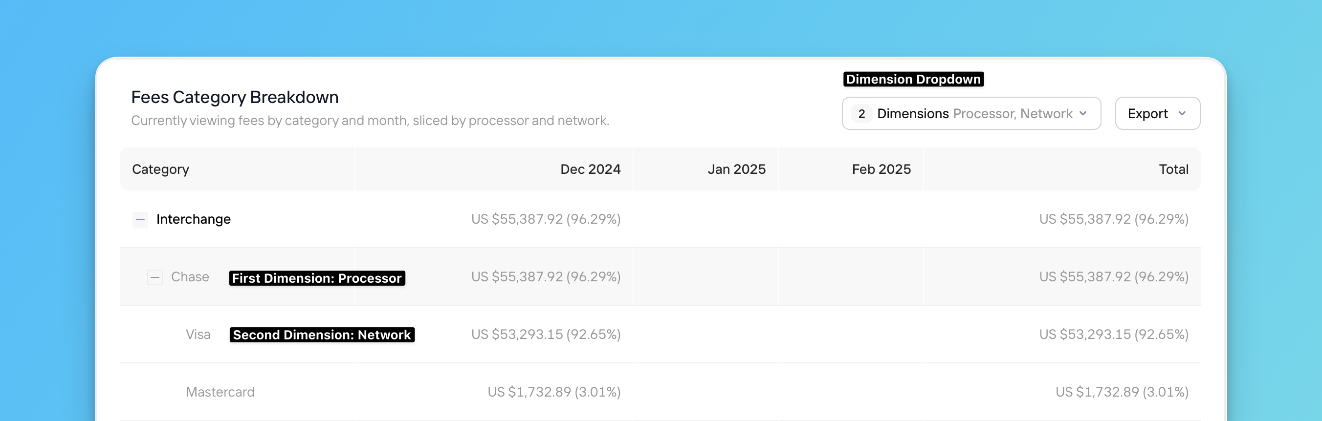
## Dimensions Drop-Down Menu
The tables in the **Fees**, **Invoices**, and **Interchange & Assessments** pages contain a unique **Dimensions** drop-down menu. Using this feature, you can select the dimensions you want to further break down your payments data by in the table—essentially mimicking pivot tables but within the Pagos Service Panel.
To customize your data groupings:
Click **Select Dimension** to pick the first dimension. A **+** icon will then appear on each row in the table; click this icon to expand additional rows that subdivide your data by the first dimension.
Click **Dimensions** again, then click **Select Dimension** to pick a second dimension to further subdivide your data by. Each row created by the first dimension will now have a +; click this icon to expand further subdivided rows of data.
For example, say you applied the following dimensions to the **Fees Category Breakdown** table on the **Fees by Category** page:
* **First Dimension**: Processor
* **Second Dimension**: Network
Your chart rows would then look like this:
Payment processing inherently comes with costs of all kinds—bank fees like interchange rates, assessment fees from card brands, and processor fees from the payment processors themselves. Understanding what costs you're accumulating and from where can help your business assess overall profitability and performance. When you know where costs come from, you might even find opportunities to reduce them and improve your bottom line!
Costs contains the following pages:
* [Fees](#fees)
* [Invoices](#invoices)
* [Effective Rate](#effective-rate)
* [Interchange & Assessments](#interchange-%26-assessments)
* [Penalties](#penalties)
**Important Notes About the Costs Pages**:
* The Date Range filter defaults to a **Monthly** time interval, because processors provide cost data on a monthly cadence.
* Any time-sensitive data appears in Coordinated Universal Time (UTC).
## Navigating the Costs Pages
Below is a basic outline of how to navigate around your Costs pages. For more details on a specific Costs page, see the affiliated section.
To navigate the Costs pages:
Click **Costs** in the main navigation, then click the desired Costs page. For [Fees](#fees) and [Invoices](#invoices), choose the appropriate page to view your data broken down **by Category** or **by Subcategory**.
* Fee categories include Interchange, Assessments, Processor, and more. View our [Fee Type Category Codes](/response-codes/fees/fee-type-category-codes) reference guide for a complete list.
* Fee subcategories further break fees down by details such as value added services, adjustments, processor penalties, and more. View all subcategories in our [Fee Type Subcategory Codes](/response-codes/fees/fee-type-subcategory-codes) reference guide.
Click a tab at the top of the page to determine how we break down your cost data in the bar graph (i.e. the x-axis values), for example by **Processor** or **Card Brand**. The tab options are different on each Costs page.
Each tab displays your entire dataset for the selected time period. For example, the **Card Brand** tab on the **Fees by Category** page focuses on the per-card brand breakdown of your fees, but it still displays all your fee data—not just fees associated with card transactions. Non-card transactions appear under their own payment methods alongside the card brand buckets. To only view cost data for specific segments of your data (e.g. only card transactions), use the [filter options](#cost-filters).
Use the **Date Range** filter in the top-right corner of the page to change the time period. You can view data broken down by Month, Quarter, or Year.
Click **Add Filter** to filter for specific segments of cost data. Learn more about the filter options available in Costs pages [in the section below](#cost-filters).
Each page contains a graph and a table, demonstrating your cost data for the chosen time period. How your cost data is broken down in these visualizations depends on the page and tab you select.
* Click the **Compare to Previous Period** toggle to add the cost data from the previous period to the graph.
* Manipulate the data using the [Dimensions drop-down](#dimensions-drop-down-menu).
Click **Export** to select from the following options:
* **Aggregated Data** - Download the data displayed in the table, plus fee description information, aggregated by month. If you've applied any [filters](#cost-filters) to your data, these customizations will be reflected in the exported data. Downloaded files will appear in your **Exports** page.
* **Enhanced Data** - Download the same data as the **Aggregated** option, but without the monthly aggregation.
* **Transaction-Level Data** - At an additional cost, download data for the individual transactions included in the table. Downloaded files will appear in your **Exports** page; learn more in our [Pagos Transaction Level Data Exports](/insights/data-exports) guide.
## Fees
There are two separate pages for viewing your fee data:
* **Fees by Category**
* **Fees by Subcategory**
In either page, the **Total Fees** value at the top of the page shows the total amount of fees your business faced in the chosen time period, along with a comparison to the previous time period. Select from the following tabs to determine how we'll organize your fee data:
In the **Overview** tab, you'll find the following data visualizations:
* **Fee Distribution** - A bar demonstrating the distribution of your total fees by category/subcategory.
* **Fees Category/Subcategory Costs** - A stacked bar graph demonstating your total fee amount over time, broken down by category/subcategory.
* **Fees Category/Subcategory Breakdown** - A table with rows for each category/subcategory and columns for each time interval; use the [Dimensions drop-down](#dimensions-drop-down-menu) to customize the table.
In the **Processor** tab, you'll find the following data visualizations:
* **Fee Distribution** - A bar demonstrating the distribution of your total fees by processor.
* **Fees Category/Subcategory Costs** - A stacked bar graph demonstating your total fee amount for each of your individual processors, broken down by category/subcategory.
* **Fees Category/Subcategory Breakdown** - A table with rows for each category/subcategory and columns for each of your processors; use the [Dimensions drop-down](#dimensions-drop-down-menu) to customize the table.
In the **Network** tab, you'll find the following data visualizations:
* **Fee Distribution** - A bar demonstrating the distribution of your total fees by card network.
* **Fees Category/Subcategory Costs** - A stacked bar graph demonstating your total fee amount for each card network, broken down by category/subcategory.
* **Fees Category/Subcategory Breakdown** - A table with rows for each category/subcategory and columns for each card network; use the [Dimensions drop-down](#dimensions-drop-down-menu) to customize the table.
In the **MID** tab, you'll find the following data visualizations:
* **Fee Distribution** - A bar demonstrating the distribution of your total fees by MID. Keep in mind, only those MIDs with the most fees will appear; those with minimal fees will be group together under the category of *All Other MIDs*.
* **Fees Category/Subcategory Costs** - A stacked bar graph demonstating your total fee amount for each MID, broken down by category/subcategory.
* **Fees Category/Subcategory Breakdown** - A table with rows for each category/subcategory and columns for each MID; scroll horizontally to view all MIDs and use the [Dimensions drop-down](#dimensions-drop-down-menu) to customize the table.
Use the [**Only New Fees** toggle](#new-fee-filtering) to filter the data visualizations for fees you haven't seen before.
## Invoices
The Invoices pages only shows data imported from Adyen and Braintree.
There are two separate pages for viewing your invoice data:
* **Invoices by Category**
* **Invoices by Subcategory**
In either page, the **Total Invoices** value at the top of the page shows the total amount of invoiced fees from Adyen and/or Braintree in the chosen time period, along with a comparison to the previous time period. Select from the following tabs to determine how we’ll organize your invoiced fee data:
In the **Overview** tab, you'll find the following data visualizations:
* **Invoice Distribution** - A bar demonstrating the distribution of your total invoices by category/subcategory.
* **Invoices Category/Subcategory Costs** - A stacked bar graph demonstating your total invoice amount over time, broken down by category/subcategory.
* **Invoices Category/Subcategory Breakdown** - A table with rows for each invoice category/subcategory and columns for each time interval; use the [Dimensions drop-down](#dimensions-drop-down-menu) to customize the table.
In the **Processor** tab, you'll find the following data visualizations:
* **Invoice Distribution** - A bar demonstrating the distribution of your total invoices by processor.
* **Invoices Category/Subcategory Costs** - A stacked bar graph demonstating your total invoice amount for each of your individual processors, broken down by category/subcategory.
* **Invoices Category/Subcategory Breakdown** - A table with rows for each invoice category/subcategory and columns for each of your processors; use the [Dimensions drop-down](#dimensions-drop-down-menu) to customize the table.
In the **MID** tab, you'll find the following data visualizations:
* **Invoice Distribution** - A bar demonstrating the distribution of your total invoices by MID. Keep in mind, only those MIDs with the most invoices will appear; those with minimal invoices will be group together under the category of *All Other MIDs*.
* **Invoices Category/Subcategory Costs** - A stacked bar graph demonstating your total invoice amount for each MID, broken down by category/subcategory.
* **Invoices Category/Subcategory Breakdown** - A table with rows for each invoice category/subcategory and columns for each MID; scroll horizontally to view all MIDs and use the [Dimensions drop-down](#dimensions-drop-down-menu) to customize the table.
## Effective Rate
**Data Availability:**
* The Effective Rate page only shows data imported via the [Data Ingestion API](/importing-data/the-pagos-data-ingestion-services#api-method) or from the following processors: Adyen, Amex, Braintree, Chase, dLocal, Ebanx, Klarna, PayPal, Stripe, and Worldpay (Vantiv)
* At this time, you can't use the **Payment Method Type** or **Card Brand Data** filters to filter Braintree data on the Effective Rate page.
Effective rate is calculated by dividing your total fee amount by your gross sales value. The gross sales value is the total value of all approved transactions processed in the chosen time period, calculated before subtracting any refunds or chargebacks; the total fee amount includes all interchange, assessment, and processor fees.
The **Effective Rate** page contains a line graph and table demonstrating your effective rate over the last 3 months; click a row in the table to view the fee and sale amounts used to calculate the stated effective rate.
Select from the following tabs at the top of the page to view your effective rate for segments of your transaction volume. The tab you choose determines what customer segments the graph and table show effective rate data for:
The line graph demonstrates the effective rate over time for your entire transaction volume.
The graph includes lines charting the effective rate over time for each processor you've routed transactions through. Use the table to remove or add specific processors to the graph.
The graph includes lines charting the effective rate over time for each card brand you've processed transactions for. Use the table to remove or add specific card networks to the graph.
The graph includes lines charting the effective rate over time for each MID you've processed transactions through. Use the table to remove or add specific MIDs to the graph.
If you process transactions through Chase, keep in mind that Chase doesn't always pass MID information in the reports used to generate effective rate. When the MID is missing, this graph will display effective rate for the entire Chase [data connection](/importing-data/managing-data-connections).
The graph includes lines charting the effective rate over time for each type of payment method you've processed transactions for (e.g. card, Applepay, Klarna, etc). Use the table to remove or add specific payment methods to the graph.
The graph includes lines charting the effective rate over time for each settlement currency you've processed transactions in (e.g. USD, AUD, CAD, etc). Use the table to remove or add specific currencies to the graph.
## Interchange & Assessments
The Interchange & Assessments page only shows data imported from Adyen.
The **Total Fees** value at the top of this page shows the total amount of fees your business faced in the Interchange and Assessments cost categories for transactions processed through Adyen in the chosen time period, along with a comparison to the previous time period. Select from the following tabs to determine how we organize your fee data:
In the **Overview** tab, you'll find the following data visualizations:
* **Fee Distribution** - A bar demonstrating the distribution of your total Interchange and Assessments fees by subcategory.
* **Interchange & Assessments Costs** - A stacked bar graph demonstating your total Interchange and Assessments fee amount over time, broken down by subcategory.
* **Interchange & Assessments Breakdown** - A table with rows for each Interchange and Assessments fee subcategory and columns for each time interval; use the [Dimensions drop-down](#dimensions-drop-down-menu) to customize the table.
In the **Network** tab, you'll find the following data visualizations:
* **Fee Distribution** - A bar demonstrating the distribution of your total Interchange and Assessment fees by network.
* **Interchange & Assessments Costs** - A stacked bar graph demonstating your total Interchange and Assessments fee amount for each card network, broken down by subcategory.
* **Interchange & Assessments Breakdown** - A table with rows for each Interchange and Assessments fee subcategory and columns for each card network; use the [Dimensions drop-down](#dimensions-drop-down-menu) to customize the table.
In the **MID** tab, you'll find the following data visualizations:
* **Fee Distribution** - A bar demonstrating the distribution of your total Interchange and Assessments fees by MID. Keep in mind, only those MIDs with the most fees will appear; those with minimal fees will be group together under the category of *All Other MIDs*.
* **Interchange & Assessments Costs** - A stacked bar graph demonstating your total Interchange and Assessments fee amount for each MID, broken down by subcategory.
* **Interchange & Assessments Breakdown** - A table with rows for each Interchange and Assessments fee subcategory and columns for each MID; scroll horizontally to view all MIDs and use the [Dimensions drop-down](#dimensions-drop-down-menu) to customize the table.
Use the [**Only New Fees** toggle](#new-fee-filtering) to filter the data visualizations for fees you haven't seen before.
## Penalties
The Penalties page only shows data imported from Adyen, Braintree, Chase, Stripe, Worldpay (Vantiv), and Worldpay Core.
Managing the many charges and penalties your business faces when processing payments can easily become overwhelming. As such, this page is dedicated specifically to helping you understand and ultimately reduce the penalties you pay. The total amount of penalties paid in the given time period appears at the top of the page, along with a comparison to the previous time period. Select from the following tabs to determine how we organize your penalty data:
In the **Overview** tab, you'll find the following data visualizations:
* **Penalties** - A stacked bar graph demonstrating your total penalties over time, broken down by penalty type.
* **Penalty Breakdown & Guidance** - A table with rows for each penalty type and columns for each time interval. Click on a penalty to view a full description of the penalty, along with practical guidance on how to avoid it moving forward. Click **Export** in the top-right corner of the table to export the data, descriptions, and guidance as a CSV.
In the **Processor** tab, you'll find the following data visualizations:
* **Penalties** - A stacked bar graph demonstrating your total penalties for each processor, broken down by penalty type.
* **Penalty Breakdown & Guidance** - A table with rows for each penalty type and columns for each processor you use. Click on a penalty to view a full description of the penalty, along with practical guidance on how to avoid it moving forward. Click **Export** in the top-right corner of the table to export the data, descriptions, and guidance as a CSV.
In the **Network** tab, you'll find the following data visualizations:
* **Penalties** - A stacked bar graph demonstrating your total penalties for each card network, broken down by penalty type.
* **Penalty Breakdown & Guidance** - A table with rows for each penalty type and columns for each card network you accept. Click on a penalty to view a full description of the penalty, along with practical guidance on how to avoid it moving forward. Click **Export** in the top-right corner of the table to export the data, descriptions, and guidance as a CSV.
In the **MID** tab, you'll find the following data visualizations:
* **Penalties** - A stacked bar graph demonstrating your total penalties for each of your MIDs, broken down by penalty type.
* **Penalty Breakdown & Guidance** - A table with rows for each penalty type and columns for each MID; scroll horizontally to view all MIDs. Click on a penalty to view a full description of the penalty, along with practical guidance on how to avoid it moving forward. Click **Export** in the top-right corner of the table to export the data, descriptions, and guidance as a CSV.
## Cost Filters
The Costs section only shows data related to payment processing costs. As such, not all of the [filter options](/insights/insights-data-filters#filter-options) available elsewhere in Insights apply to this section. You can use the following filters to segment the data displayed in the Costs pages:
* Date Range
* Processor
* Card Brand
* Card Type (this filter only applies to the **Interchange & Assessments** page)
* Payment Method Type
* Settlement Currency
* [Fee Type](/response-codes/fees/fee-type-codes)
* [Fee Category](/response-codes/fees/fee-type-category-codes)
### New Fee Filtering
The [Fees](#fees) and [Interchange & Assessments](#interchange-and-assessments) pages include a **Only New Fees** toggle in the top-right corner of the stacked bar graph. Click this toggle to filter the entire page to only show data for the newest fees you've faced.
We define new fees as those you haven't encountered before on a given MID and from a given card network. Because we evaluate fees at the MID and card network level, a fee will still be flagged as new even if it has shown up before on a different MID or from a different network on the same MID.
If you apply this filter and export the data, the downloaded CSV will include a **New Fee** column. Each fee will be marked as either:
* *yes* - A confirmed new fee for the associated MID and/or card network
* *under review* - A fee we're reviewing and mapping
Fees marked *under review* may appear with the name *Unknown* until we finalize their details; check back later for updates.
The **Only New Fees** toggle doesn't account for:
* Fee adjustments
* Fees in the [fee category](/response-codes/fees/fee-type-category-codes) of `informational_data`
* Changes in fee amounts or rates
## Dimensions Drop-Down Menu
The tables in the **Fees**, **Invoices**, and **Interchange & Assessments** pages contain a unique **Dimensions** drop-down menu. Using this feature, you can select the dimensions you want to further break down your payments data by in the table—essentially mimicking pivot tables but within the Pagos Service Panel.
To customize your data groupings:
Click **Select Dimension** to pick the first dimension. A **+** icon will then appear on each row in the table; click this icon to expand additional rows that subdivide your data by the first dimension.
Click **Dimensions** again, then click **Select Dimension** to pick a second dimension to further subdivide your data by. Each row created by the first dimension will now have a +; click this icon to expand further subdivided rows of data.
For example, say you applied the following dimensions to the **Fees Category Breakdown** table on the **Fees by Category** page:
* **First Dimension**: Processor
* **Second Dimension**: Network
Your chart rows would then look like this:
 To remove a dimension from a table, click the **Dimensions** drop-down menu, click on the dimension, then click **None**.